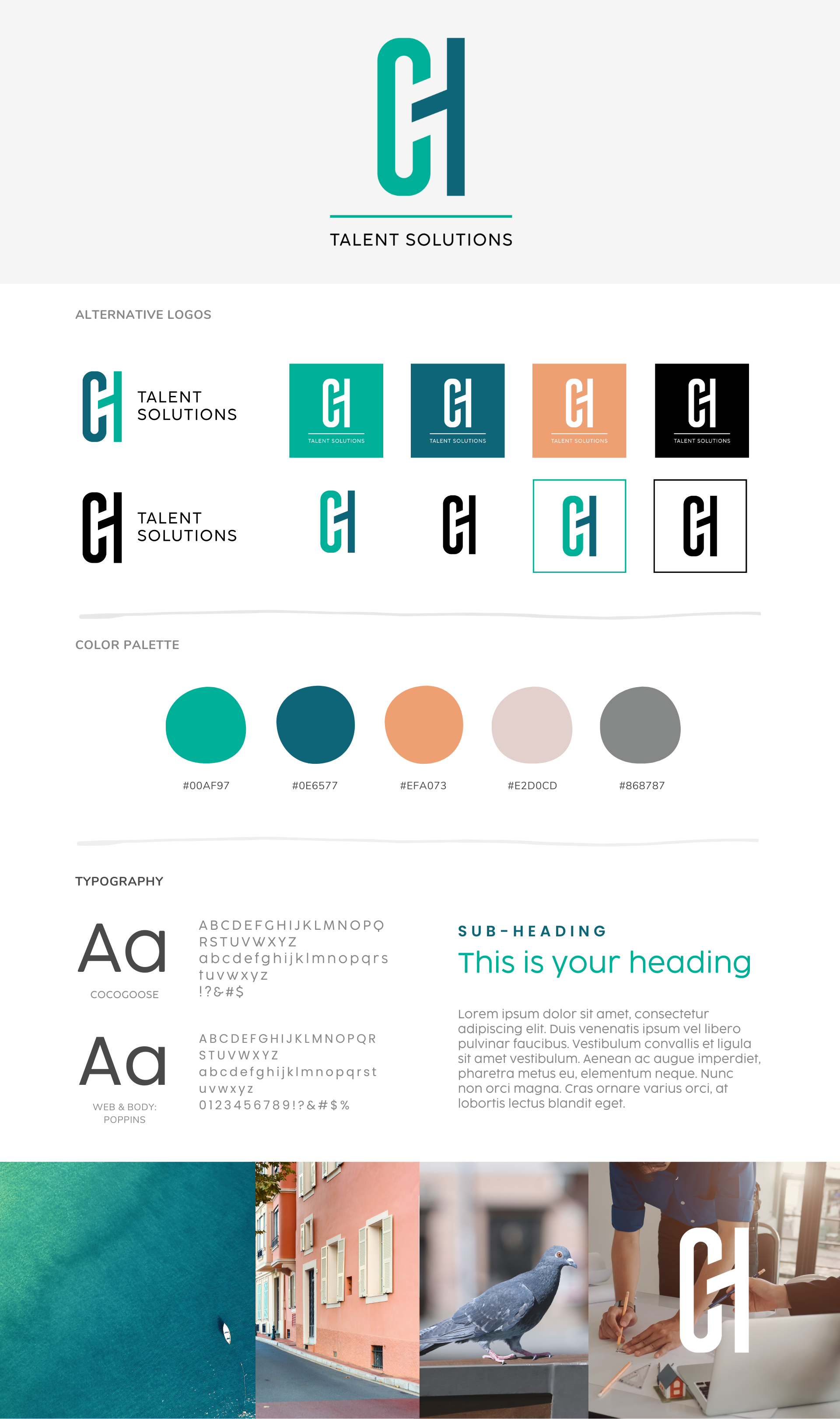
Logo design for CH Training Solutions
CH Talent Solutions, spearheaded by experienced facilitator Carrie Hutton, specializes in providing leadership development training tailored for professionals in the architectural industry. With a focus on fostering leadership skills and promoting growth, CH Talent Solutions aims to empower individuals and organizations to achieve their full potential.
The Task Ahead
As Carrie embarked on a new venture with CH Talent Solutions, she recognized the importance of establishing a strong visual identity that would effectively communicate the essence of her business. Carrie sought a distinctive and versatile logo that would resonate with her target audience while aligning seamlessly with her vision and mission.

The Solution
Fingerprint Marketing undertook the task of crafting a brand new logo for CH Talent Solutions. The solutions provided aimed to address Carrie’s requirements for a clean, robust, and versatile logo that could stand the test of time.
Architectural Monogram Symbol: Our design team conceptualized a logo design incorporating an architectural-like monogram symbol. The symbol served as a visual representation of CH Talent Solutions’ focus on the architectural industry while conveying a sense of professionalism and expertise.
Vibrant Color Palette: To inject vibrancy and energy into the brand identity, we selected a vibrant color palette that resonated with the company’s dynamic approach to leadership development. The colors were carefully chosen to evoke a sense of creativity, innovation, and trust.
Simple Font: A clean and modern font was chosen to complement the architectural monogram symbol and maintain visual harmony within the logo. The simplicity of the font ensured readability and versatility across various applications and platforms.
Why CH Talent Solutions loves their new logo
The combination of the architectural, monogram symbol, vibrant color palette, and simple font captured the essence of the company’s mission and values. The logo not only reflected CH Talent Solutions’ commitment to excellence in a competitive industry, but also conveyed a sense of professionalism and innovation that resonated with clients and stakeholders alike.
As CH Talent Solutions continues to evolve and expand its offerings, the next phase of the project will focus on developing logos for various training programs offered. With a cohesive visual identity in place, CH Talent Solutions is poised for success as it embarks on its new adventure.
